Let's Talk About Value in Quilts Again
 Kathie Kerler
When Coordinating Fabrics Are Not Your Best Friend
Let's take a look a this mini-quilt. Do you know what it is? I do, because the title on the back says, "Wonky House". Look closely and you see that it's a log cabin block pieced askew. But why don't you see it right away?
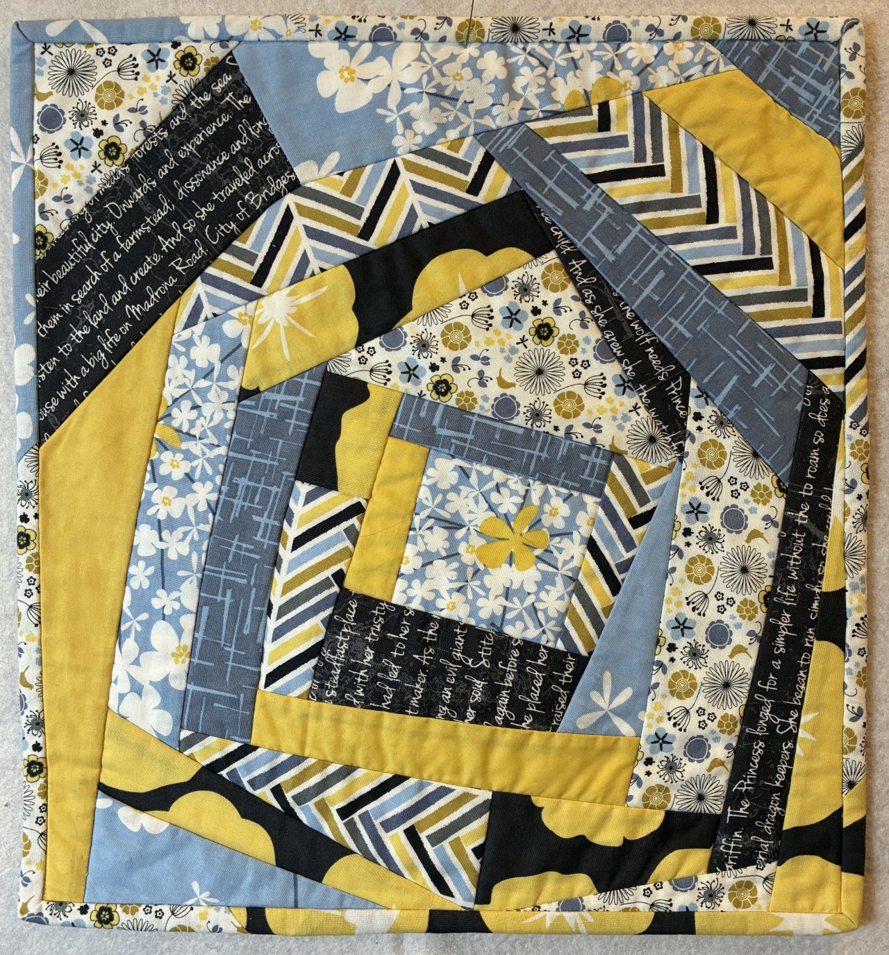
There are a few reasons. We see the maker used a coordinating line of fabric, so the colors all match. That may seem like a good idea. But there are several busy patterns butted up against one another, so our eyes don't distinguish the log cabin pieces from one another. They blend together. Another problem is that there really isn't a distinct range of values from light to dark. While there is a very dark black print, it's placed randomly rather than with intent to form a shape. Another issue is the yellow flower on black background print. It looks blotchy, because the print is too large for the log cabin pieces.
One tip to avoid these problems is to select fabrics from more than a single designer/manufacturer with an eye to a range of values from very light to very dark. Avoid using all medium values and your quilts will have greater visual impact.https://courses.kathiekerler.c...
Categories: : Elements of Design