How Important is Value Contrast?
 Kathie Kerler
This happens when the values are similar.
I signed up for a class called "Appliqué From the Backside". It featured eight-pointed appliquéd stars, which really appealed to me. I wouldn't have to worry about perfectly pieced points, and I love appliqué. Since it was going to be a small quilt, it was easy to pull fabrics from my stash. I thought I would give the finished quilt to my niece for her room. Her favorite colors were purple and green, so I chose purple fabric for the background and a different green for each of the nine stars. Here's the result.
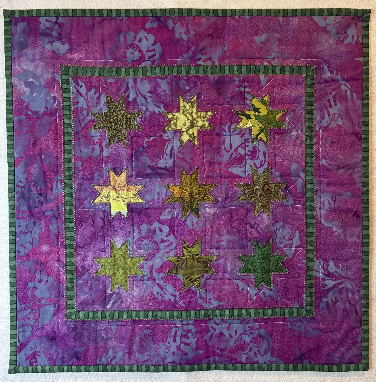
What went wrong? While green and purple are complementary colors, I didn't pay attention to values. Only a few stars are light enough in value to be seen from even a short distance. Making matters worse, notice how the background is a mottled print. And--the stars all contain prints. Your eye blends everything together and can't appreciate the stars as individuals or the detail of the blanket stitch appliqué. I realized this when I got home from the class. I was no longer looking at the quilt under the bright light of the sewing machine. I determined after this to always audition my fabric choices pinned up on a design wall. We talk all about Value in my Quilt Judging Course as part of the importance of design.
https://courses.kathiekerler.c...
Categories: : Elements of Design